Keep those colours simple stupid
Alola, all! Today, we’re diving into the world of colour theory, a crucial aspect of character design. Understanding how colours interact can breathe life into your characters. A good starting point is keeping a small colour palette. Aim for just a few shades—this helps maintain visual harmony and prevents your design from becoming overwhelming.
There’s a lot you can do with something as simple as 2-3 main colours for the character design. You can experiment a little more than that but keep things limited to start with! Last thing you want is to make the design look like a real mess.
The Power of Colour Saturation

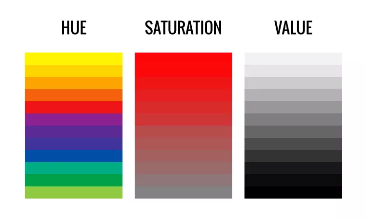
You ever shade a character, and it just looks so disgustingly awful? Maybe it hurts just to look at the character. Either way, it’s likely because of the saturation.
Saturation is simply the intensity of colour, you’ll understand it as how intense that colour is. You should NOT be using highly saturated colours for all of your OC design.
You should limit the use of highly saturated colours to focus points within your character design. Bright colours can draw the eye, but using them sparingly ensures they stand out effectively. Think of using a bright hue for your character’s eyes or an accessory while keeping the rest more muted. Remember, exceptions like light or highlights can be made, but moderation is key!
Black and White – God’s blessing

Contrasts are important, so ultimately colours like black and white are perfect for character design! There’s a reason you see black and white in a lot of characters designs. It’s because they are easy shades to mix with other colours, as they go well together.
It’s much harder to make a colour like Red or Blue work with the whole palette compared to black and white, so it’s best at the beginning to focus on those as either a base shade or at least the shade you use to compliment the rest of your colour scheme.
Experimentation and Personal Style
As you gain experience, you’ll find that some rules are meant to be broken! Every artist develops their unique style through experimentation. Don’t hesitate to play around with your palette and saturation levels. Just keep in mind not to overcomplicate things. Trust your instincts and have fun with your designs!
I’ve got plenty of OCs that break those norms, whether It’s because I’ve added more saturated parts that go well with the character or just limited myself.

Or if you see above, it’s a mix of both. I’m using highly saturated yellow for my OC Gaishune while also sticking to mostly 1–2 colours. She’s a magical girl, so it makes sense both lore wise and through a character design perspective. She’s a flashy girl, so it makes sense that a lot of her design isn’t muted at all. If your character is a more depressing or serious character, you wouldn’t want the colours to be so flashy and make them standout badly.
In conclusion, mastering colour theory won’t happen overnight, but with practice and these guidelines in your toolkit, you’ll be on your way to creating stunning characters. Happy designing, and remember: the best part of art is making it your own.
Zuiri out~

